Sunday, October 19, 2008

Remote Sensing map image


www.spatiallyadjusted.com

This image is an image taken using a system called remote sensing. The image can be viewed using the search engine, Google Earth.

Saturday, October 11, 2008

Index Value Plot


www.marketscreen.com/.../images/swingindex-1.gif

An index value plot is a geovisualization map that plots the departures relative to a given index value.

Dot Distribution Map


www.botany.wisc.edu

Dot distribution maps help show the distributions of populations and other data. Dot distributions are used by the military, community governments, businesses etc. The above dot distribution represents a certain species of plant that scientists are studying.

Bathymetric Map


www.uni.edu/.../image002.gif

A Bathymetric Map is a map that accurately depicts all of the various depths of a water body. A bathymetric map or chart usually shows floor relief or terrain as contour lines (called depth contours or isobaths), and may additionally provide surface navigational information. Color-coding to show the different depths of water is a common methodology used in bathymetric maps.

Population Profile


www.uni.edu/.../image002.gif

Population profiles show trends in population statistics over time. The image above shows how Kenya has had a population boom over the years while the United States stays somewhat stagnant and Germany has a negative population growth. These types of graphs give governments an idea as to how their populations are incresing and where they need focus their efforts.

Star Plot


zoonek2.free.fr/UNIX/48_R/03.html

Star Plots are a type of visualization that allow you to compare multiple variables for each observation. Each observation is represented as a star-shaped figure with one ray for each variable. A legend often accompanies a Star Plot to identify what the variables are and in what location (or on what ray) each variable is represented. The star map above describes different soil densities.

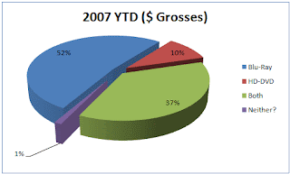
Pie Charts


www.ps3forums.com/showthread.php?t=83711

Pie Charts are one of the most common geovisualization instruments on the market today. Pie charts are very easy to interpret and help individuals and companies visualize their data. Pie charts are a step up from the old bar charts that plagued board room discussions and school projects for years. The above pie chart displays the YTD grosses of HD DVD, Blue Ray DVD's and combined grosses of the two.

Digital Raster Graphics


www.lmic.state.mn.us/bmap90/drg/drg.htm

A digital raster graphic (DRG) is a scanned image of a U.S. Geological Survey (USGS) standard series topographic map as a backdrop data layer. The raster image usually includes the original border information, referred to as the "map collar". The image above shows the state capital downtown mall area of St. Paul, Minnesota.

Lorenz Curve (Accumulative Line Graph)


www.answers.com/topic/lorenz-curve

A graph for showing the concentration of ownership of economic quantities such as wealth and income; it is formed by plotting the cumulative distribution of the amount of the variable concerned against the cumulative frequency distribution of the individuals possessing the amount. The Lorenz Curve above discusses the disparity in percentage of income to the percentage of housholds. The curve shows the level of inequality in the two variables.

DEM (Digitial Elevation Model)


www.dpi.vic.gov.au/.../digital_elevation_models

Digital Elevation Models provide a snapshot of the land. A Digital Elevation Model (DEM) is best described as a spatially geo-referenced data set that is a popular way of encoding the topography for environmental modelling purposes. Different models can be used to plot roads, railroads, buildings and communities. DEM's are built using remote sensing techniques. The above model shows slope, elevation and aspect of the land being studied.

Parallel Coordinate Graph


bdtnp.lbl.gov/.../ParallelCoordinate_MainGUI.png

Parallel coordinates are a common information visualization technique for high-dimensional data sets. In a parallel coordinate view, a data set consists of a set of samples. Each variable in the data plot is represented as its own Y Axis on the graph. A maximum point for each Y axis is selected, and they are scaled relatively to each other so that each variable takes up the same area in the graph space.

Dopplar Radar


www.noaanews.noaa.gov/stories/images/

A Doppler Radar uses the Doppler effect of returned echoes from certain objects to measure their radial velocity. They are used for various things including air traffic control, police speed guns, and air defense. Here is a photograph from a Doppler Radar of a Hurricane slamming into the coastline of Texas. Doppler Radar can be used by meteorlogists to determine weather patterns and forcastes.

LIDAR


http://imaging.geocomm.com/gallery

LIDAR (Light Detection and Ranging) is an optical remote sensing technologay that measures different properties of dispersed light to find range or other information of a distant target. The difference between lidar and radar is that lidar uses shorter wavelenths of the electromagnetic spectrum, generally close to infrared.
Here is a LIDAR image of ground zero after the Sept. 11 attacks.

Bivariate Choropleth Map


gis.esri.com/.../proceed/papers/pap171/p1712.jpg

Bivariate mapping is an important mapping technique in cartography. Given a set of geographic features, it maps two variables on a single map by combining two different sets of graphic symbols. Bivariate maps may consist of point features, line features or polygon features. The above bivariate map shows the median house value for different counties in Ohio.

Black and White Aerial Photo


freegeographytools.com/.../2007/09/doq-thumb.jpg

The image above is a black and white photo of an unknown city. It shows steets, buildings as well as natural features. Black and White photos are tough to read and can minimally be used for mapping purposes.

Infrared Aerial Photo


www.geology.enr.state.nc.us/.../Slide54_660.gif

Infrared aerial photos can are a geovisualization map type that is used by NASA, geologists, seismologists and many other areas of study. Infrared photos can be used to detemine land positioning as well as contour and elevation. The Color-infrared aerial photograph above shows a reconnaissance map of debris fan, debris fan source areas, and alluvial deposits in the Maggie Valley area after a recent mud slide and debris flow.

Range Graded Proportional Circle Map


www.forthgo.com/.../2007/11/ch2007bubble.png

A Range-Graded Proportional Circle Map is a proportional circle map, where point data is mapped with a circle instead of a dot, and there are a finite or set number of sizes used for the circles. The example above shows circles of voter distribution and which candidate was voted for by either democratic (blue) and republican (red) parties.

Wind Rose


www.nws.noaa.gov/.../html/images/cli-new4.png

The Wind Rose map shows a type of geovisualization in the for of a circular plot. The winds in the image above are displayed in a form of concentric wedges, split into segments reflecting wind speed. The area of each segment is proportional to the total time of wind falling into specific speed/direction category

Histogram


www.statcan.ca/.../power/ch9/images/histo1.gif

The histogram is used to summarize discrete or continuous data that are measured on an interval scale. It is often used to illustrate the major features of the distribution of the data in a convenient form. A histogram divides up the range of possible values in a data set into classes or groups. Histograms such as the one above are very easy to interpret. They are a form of a bar graph.

Box Plot


www.mathworks.com/.../toolbox/stats/boxplot.html

A box plot, or box and whisker diagram, provides a simple graphical summary of a set of data and is a standardized way of displaying the distribution of data based on the five number summary: minimum, first quartile, median, third quartile, and maximum. It shows a measure of central location the median), the average, and measures of dispersion. The plot above shows car mileages grouped by different countries.

Stem and Leaf Plot


mainland.cctt.org/.../images/table2.gif

Stem and Leaf plots are fairly simple to read. The digit(s) in the greatest place value(s) are the data values of the stems. The digits in the next greatest place values are the leaves. For example, if all the data are two-digit numbers, the number in the tens place would be used for the stem. The number in the ones place would be used for the leaf. The plot above is an example of per capita GNP for Western Africa. The way the data is read is 1 : 80 is ahown as 180.

Triangular Plot Map


www.beyondveg.com/.../chivers1992p61.gif

The image above is Triangle Plot. A triangle plot, plots three different variables. In this example the data plotted is used to determine what type of food certain primates eat. The data shows that certain primates feed more on fruits, flowers, seeds, gum and sap. The data shows that there was little animal matter found in the gut of the primates tested.

Proportional Cricle Maps


www.neiu.edu/~ejhowens/377/examples.htm

Proportional Cricle Maps are used by applying a formula to control the area of circles and then applying precise expansion factors. Scientists and research analysts create proportional circle maps in which the circle area reflects some attribute value. The above map shows the Mexican population in the western United States since 1990. The larger spheres represent larger populations while the smaller spheres represent smaller populations.

Correlation Matrix


www.mega.nu/ampp/rummel/uc.htm

The correlation matrix is basic to many kinds of analysis. It is a bridge over which scientists can move from their data to sophisticated statistical analyses of patterns, dimensions, factors, causes, dependencies, discriminations, taxonomies, or hierarchies. Each coefficient measures the degree and direction (sign) of the correlation between the row and column variables. The statistical analysis above shows certain variables (GNP per capita, Trade, Power, Stability,..etc) and how they correlate to one another.

Similarity Matrix


www.scielo.cl/fbpe/img/ejb/v10n4/a10/ap2b.jpg

The map above is an example of a Similarity Matrix. This type of map shows the similarity between two data points. Similarity Matrices are used in a sequence alignment. Higher scores are associated with more similar scores. The map above shows a genestic similarity matrix. It was computed using two different formulas in order to produce two similar data points.

Nominal Area Choropleth Map


mapmaker.rutgers.edu/355/africa_political.gif

The map above is a nominal choropleth map that has no ordering of groupings. It is a qualitative classification of groups. The map is a political map of Africa. It does not show any specific level or order of the political affiliations represented.

Univariate Choropleth Map


www.socialexplorer.com/pub/maps/images/sample

A Univariate choropleth map like the one shown above, only shows information regarding one variable. In this map, the variable is population density for the New England Areas. The darker colors tend to be populated metropolitan areas while the lighter colors show less population density. A company may use this type of map to determine whether it would be beneficial for them to build in a certain area due to the population density.

Isopach maps


pubs.usgs.gov/.../HTMLDOCS/FIGURES/FIG13_IN.JPG

The image above represents an Isopach map of Halocene aged sediment. Isopach maps are used by geologists and scientists througout the world. They are also used by mining companies and research facilities to determine fallout from volcanic activity or an earthquake.

Unstandardized Choropleth Map


www.neighbourhood.statistics.gov.uk/HTMLDocs/...

Choropleth maps use color showing percent, average value or other data in a geographic area. Only raw numbers are untilized in unstandardized choropleth maps therefore causing the data outcome to be raw data instead of an average. The map above shows the amount of spending (in millions) by overseas residents in 2003, and it classifies the raw data into five intervals.

Bilateral Graph


http://www.acdi-cida.gc.ca/CIDAWEB/acdicida.nsf/En/EMA-21812034-NEY

Bilateral graphs are used in various aspects of everyday life. These types of graphs are maps of information and provide a person with pertinant data. Bilateral graphs are used in all job fields as well as private and public research. The Bilateral graph above displays information about disbursements to certain areas of study. The map is bilateral because it has two sides with different variables to measure that conincide with each other to interpret the data.

Friday, September 26, 2008

Propaganda Maps


mapanalysisnoles949.blogspot.com/2008/06/prop...

Propaganda maps are used to play with the psychi of a population. These type maps are used more in war situations and for political rhetoric. Propaganda maps can be used to influence a population much like Hitler did not WWII.

Hyposmetric Maps


atlas.nrcan.gc.ca/.../map5.jpg/image_view

Hypsometric maps represent the elevation of the terrain with colors. The area between two neighboring contour lines receives one specific tint. Hypsometric colors are most common in topographic maps at small scales, either applied as continuous gradients or intervals. The succession of colors occurs according to different rules.
In topographic surveying, a map giving elevations by contours, or sometimes by means of shading, tinting, or batching.

PLSS Maps


sjr.state.fl.us/gisdevelopment/docs/themes.html

The PLSS is used to divide public domain lands, which are lands owned by the Federal government for the benefit of the citizens of the United States. The original public domain included the land ceded to the Federal Government by the thirteen original States, supplemented with acquisitions from native Indians and foreign powers.

Cadastral Maps


www.rpdata.net.au/news/brochures/mapping.html

A cadastral map is a map showing the boundaries and ownership of land parcels. Some cadastral maps show additional details, such as survey district names, unique identifying numbers for parcels, certificate of title numbers, positions of existing structures, section and/or lot numbers and their respective areas. County property appraisers sometimes use cadastral maps to determine survey markers and ownership boundries.

Monday, September 15, 2008

Cartograms


issrweb.asu.edu/services/gis/sample-maps.html

Cartograms are maps where the geographic unit being looked at has its size and shape altered to reflect the magnitude of the variable being looked at. Algorithms which create cartograms are designed to maintain the approximate scale and positions of the original geographic units as best as possible given the necessary distortions. The Cartogram map above shows county populations for the area of the United States.

Sunday, September 7, 2008

Remotely-Sensed Map


www.esri.com/.../solutions/remote.html

This type of Remotely Sensed map is from a satellite and shows the southeastern coast of the United States. Remotely Sensed maps can be used to measure the size of tropical storms or hurricanes. Military personnel use Remotely-Sensed satellite maps to position their troops and determine enemy positions.

Saturday, September 6, 2008

Flow Map


graphics.stanford.edu/~dphan/code/flowmap

Flow maps have long been used to show certain patterns of travel. Flow maps show movement of objects or people from one location to another. Flow maps are used for traffic development, data collection, census data and other various aspects of data collection. This specific flow map shows a migration pattern from one state to another.

Thematic Map


www.lib.wsc.ma.edu/censusaff.htm

The Thematic Map above shows a distribution of age population in a given area. This type of map is used by the Census Bureau, business's, educational purposes and many other aspects. This map type is extremely easy to read and comprehend.

Topographic Map (Contour Map)


www.answers.com/topic/contour-line

The map above is a great example of a Topographic map. It shows equal elevation through the use of contour lines. The map shows valleys, hills, high points and low points. Many people use this type of map for development purposes to establish elevations of a certain location.

Thursday, September 4, 2008

Planimetric Maps

www.nps.gov/.../fova/clr/images/map2-21.jpg

The map above shows the city of Vancouver in a Planimetric map view. There are distinct lines that outline city streets and other pertinant crossways, railroads etc. This type of map does not have relief features. This Planimetric map resembles that of a street map.

Mental Map


go.owu.edu/.../geog_222_lo13_gr/sketch_proj.jpg

I thought this was a great example of a mental map. It is a mental map of how a child perceives the world on a paper map. Obviously the map is not precise and could not be used for orientation or navigation purposes. The map does show however a child's view of the world and how he/she sees it.