Sunday, October 19, 2008

Remote Sensing map image


www.spatiallyadjusted.com

This image is an image taken using a system called remote sensing. The image can be viewed using the search engine, Google Earth.

Saturday, October 11, 2008

Index Value Plot


www.marketscreen.com/.../images/swingindex-1.gif

An index value plot is a geovisualization map that plots the departures relative to a given index value.

Dot Distribution Map


www.botany.wisc.edu

Dot distribution maps help show the distributions of populations and other data. Dot distributions are used by the military, community governments, businesses etc. The above dot distribution represents a certain species of plant that scientists are studying.

Bathymetric Map


www.uni.edu/.../image002.gif

A Bathymetric Map is a map that accurately depicts all of the various depths of a water body. A bathymetric map or chart usually shows floor relief or terrain as contour lines (called depth contours or isobaths), and may additionally provide surface navigational information. Color-coding to show the different depths of water is a common methodology used in bathymetric maps.

Population Profile


www.uni.edu/.../image002.gif

Population profiles show trends in population statistics over time. The image above shows how Kenya has had a population boom over the years while the United States stays somewhat stagnant and Germany has a negative population growth. These types of graphs give governments an idea as to how their populations are incresing and where they need focus their efforts.

Star Plot


zoonek2.free.fr/UNIX/48_R/03.html

Star Plots are a type of visualization that allow you to compare multiple variables for each observation. Each observation is represented as a star-shaped figure with one ray for each variable. A legend often accompanies a Star Plot to identify what the variables are and in what location (or on what ray) each variable is represented. The star map above describes different soil densities.

Pie Charts


www.ps3forums.com/showthread.php?t=83711

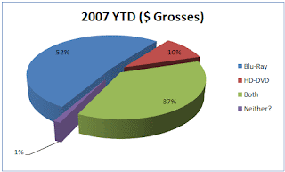
Pie Charts are one of the most common geovisualization instruments on the market today. Pie charts are very easy to interpret and help individuals and companies visualize their data. Pie charts are a step up from the old bar charts that plagued board room discussions and school projects for years. The above pie chart displays the YTD grosses of HD DVD, Blue Ray DVD's and combined grosses of the two.